

Reprint Rumble: Lord of the Rings: Tales of Middle-earth: The Fellowship of the Ring
The meeting of Magic: the Gathering and Lord of the Rings in the Tales of Middle-earth expansion feels like a full-circle moment for fantasy. Magic, like the vast majority of fantasy post-Rings, owes a substantial debt to Tolkien’s masterpiece, and it’s incredible to see that debt paid off in a full-blown celebration of the characters and stories of Middle-earth.
Beyond influencing fantasy writing and storytelling, The Lord of the Rings also had a profound impact on fantasy art, with artists like Alan Lee building central pillars of their careers around their interpretations of Tolkien’s world and characters. Magic’s artists had an unenviable task, then, in reimagining this world which has already been imagined so many times, within the confines of standard-size card frames. Reimagine it they did, however, and with style to spare. Every new piece is a marvel, packed with incidental detail and subtle touches, straddling the fine line between faithfulness to the source material and bold reinterpretation perfectly.
Reinterpretation was a priority both artistically and mechanically here, with only two small reprints present in the entire main set. Not much to go on for a Reprint Rumble, you might say, and you’d be right, were it not for the Box Topper cards included in Draft, Set, and Collector Booster Boxes of the set. These 30 cards take notable lands and artifacts from throughout Magic’s history and recast them as notable places and objects from Tolkien’s trilogy, with stunning full-art treatment to match.
How do these new pieces compare to their original versions? Which convey the mechanics and flavor of their attached cards the best? Will the sheer weight of Tolkien’s iconic scenes obliterate any sense of artistic objectivity we have left? All of these questions and more will be answered as we commence the Reprint Rumble: The Lord of the Rings: Tales of Middle-earth Edition!
Delving deep into the beauty and range of these cards will take more than just one article, however, so as our own small tribute to The Lord of the Rings we’ve decided to split this Reprint Rumble up into a trilogy, with one article for each book in the series. In this piece, we’ll be looking at each of the reprinted cards mentioned or encountered in The Fellowship of the Ring, the first book in the trilogy. So grab your friends, grab your walking stick, and prepare to venture farther from home than you’ve ever been before, as we set out on the artistic journey of a lifetime!
Reprint Rumble: Lord of the Rings
Rings of Brighthearth

OMA's Pick (Click to expand)
Classic Genius
We begin with a tricky one. Both the original Rings of Brighthearth and its reimagining as Three Rings for the Elven-Kings have stellar artwork that matches up both thematically and mechanically with the card itself.
The original starts things off with an unusual POV, placing the viewer inside a forge, watching the titular rings being removed by a pair of bare, unprotected hands. It’s a striking image, creating a sense of simultaneous wonder and danger, and implying the magical properties of the rings that are reflected in their abilities. It also makes excellent use of lighting, with a very clear divide between the fertile fires of the foreground and the burning rings, and the darkness of the hands and the room beyond. It feels mystical and deeply atmospheric, perfectly conveying the idea of the Rings as powerful artifacts in Lorwyn’s Celtic setting.
Three Rings for the Elven-Kings takes a very different approach tonally but does a similarly admirable job of creating an atmosphere of wonder and mystique. The three rings here are much smaller in size than their Brighthearth counterparts, but each glows with a different primary-colored energy, bleeding out from the hands they sit on to obscure the background with a wash of color. The T-shaped arrangement of the three hands, and the natural balance of the three primary colors used, creates a powerful scene, and one that feels all the more weighty due to the lack of background detail present.
When it comes down to it, we have to give this round to Classic Genius. While both pieces certainly feel magical, the original does so with a harder, darker edge that feels more satisfying than the floaty, ethereal majesty of the new art. We liked it, now we’re going to put a ring on it.
The Great Henge

OMA's Pick (click to expand)
New Hotness
As one of the five legendary artifacts from Throne of Eldraine, The Great Henge played a valuable role in the set, helping to establish a sense of history for the Plane by showcasing one of its formative, foundational locations. In keeping with this tone, the Henge as portrayed in the original feels alien and otherworldly, a twisting mass of tree roots forming a portal through a huge pillar of carved stone. The lone figure standing amid the green light of the portal adds to this: are they coming in or out? Are their intentions good or ill? We don’t know, and maybe we don’t want to know. This is old magic, after all.
The Party Tree, by contrast, is an exercise in straightforward, homely warmth. A huge oak tree, its boughs sheltering the tent and field in which Bilbo’s 111st birthday took place, it represents a relatable symbol of homeliness and comfort. The light from the bulbs strung up around it adds nice tinges of color to the upper branches, while the main trunk is bathed in the orange glow emanating from the party tent on the left, where the shadows of merry revelers can be seen clear as day. It’s a simple piece, but one that creates a twinge of nostalgia in the viewer, whether they know the story of Lord of the Rings or not.
Both pieces do a great job of meeting the brief and conveying the idea of a ‘Great Henge’, albeit in very different ways. We’re going to give this round to New Hotness, however, as it manages to elicit more of an emotional response than the original’s more subdued take.
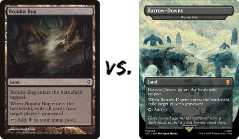
Bojuka Bog
OMA's Pick (Click to expand)
Classic Genius
A card that most enfranchised Magic players will recognize right away, Bojuka Bog is one of the best ‘spell lands’ out there, exiling an entire graveyard for the low, low price of coming into play tapped.
It’s a dark effect when translated from mechanics into flavor, and that darkness is matched perfectly by the original art, which may be one of the most striking and effective takes on a swamp the game has seen. Presenting everything on a 45-degree tilt, the piece shows scraggly weeds, thick-rooted trees, and a glassy stretch of water, solid in appearance thanks to the thick film of swamp life that covers it. In the center of the piece, a man sinks slowly into the Bog, with only one hand and his face above the surface. We have no idea who this character is, yet we can feel his struggle in his pained expression, eyes tightly shut in anticipation of the coming agony, mouth open in a last cry of despair against the cruel world that has brought him to this.
Barrow-Downs is a very different piece. Since the most iconic swamp in Lord of the Rings, the Dead Marshes, was being used for another card (check out part two of this series for that one!), the Barrow-Downs was chosen to represent the Bog here instead. The result is a moody, haunting piece, making great use of Moore’s detailed watercolour style to conjure the misty, mysterious Downs. While the ancient stone tombs, scattered headstones and rolling fog all feel thematically appropriate for a remixed Bojuka Bog, this new take lacks the cruel emotional gut punch of the original, which leaves it lagging behind slightly. Classic Genius takes this round.
Oboro, Palace in the Clouds

OMA's Pick (Click to expand)
New Hotness
This one seems cut-and-dry at first, but muddles as you delve a bit deeper into the themes of each piece. The original Oboro, part of a cycle of legendary lands that showcased the different regions of Kamigawa, is undeniably beautiful. It looks like a legitimate lost city, rising through thick banks of cloud, implying the existence of untold secrets within its spires and halls. The skyscape background is admittedly simple, but intentionally so, fading back to allow the details of the Palace itself to shine through. The sun rising behind, casting obscuring rays over part of the Palace, is a wonderful touch of realism that also feels thematically appropriate.
Bucklebury Ferry, on the other hand, shows a raft. In the middle of a river. Not a palace, nor anything close to one, and certainly not one in the clouds. Many of the boxtoppers in this set stretch things a bit when it comes to adapting the original cards, but this one takes things a step too far. Or at least, it does at first glance. When you stop thinking of the Palace as a literal place, and more as a safe haven, then everything falls into place for this piece. As they stand in the middle of the river, the raft the Hobbits are shown floating on here is a metaphorical Palace, protecting them from the red-eyed Nazgul sitting on the far bank. The mist on the river around them makes up the metaphorical Clouds, completing the picture, and creating an excellent atmosphere in combination with the orange light of the lantern and the burning red eyes of the Nazgul.
We have a choice between the literal and metaphorical for this round, then. Both are excellent, atmospheric pieces, but the audacity of Bucklebury Ferry, and the willingness of De Ro to have the cleverness of the piece pass right over many viewers’ heads, gives the edge to New Hotness on this one.
Pillar of the Paruns

OMA's Pick (Click to expand)
Classic Genius
Randy Gallegos’ Boxtopper version of this card takes some creative liberties with the subject matter as well, though not quite as effectively as those Bucklebury Ferry took. The Pillar, one of the central landmarks from the iconic Plane of Ravnica, takes the form of the sleepy Prancing Pony Inn here, in a translation that doesn’t make a huge amount of sense flavor-wise.
The Inn looks fantastic, don’t get us wrong. It’s packed with detail, evoking the ye olde atmosphere of real Tudor buildings, but with nice Middle-earth flourishes in the form of ground-level circular windows. The light shining through said windows is a lovely touch as well, conspiring with the fluffy smoke rising from the chimneys above to make the Inn feel homely and welcoming. The surrounding detail, including the flooded ruts on the well-worn road leading up to the Inn, are also excellent.
The problem isn’t the Prancing Pony itself, but rather what it’s up against. Ravnica is one of Magic’s most recognizable and beloved Planes, and it’s hard to think of a single piece of art that embodies it better than Dany Orizio’s Pillar of the Paruns. The inclusion of all 10 Guild sigils is a great start, naturally, but the dramatic angle we see them from is even better, serving to hammer home just how important these Guilds are to the city that contains them. As we move away from the center, the buildings and spires of Ravnica stretch off far into the distance, conveying the Plane’s dense urban sprawl in one succinct image.
So effective is Pillar of the Paruns at representing its home Plane, in fact, that we have no choice but to give this round to Classic Genius. Perhaps if the Prancing Pony had been representing a different land, then things would’ve been different, but as it stands this one is an easy call.
Deserted Temple

OMA's Pick (Click to expand)
New Hotness
Magic has no shortage of lost ruins and abandoned sanctums, but Deserted Temple is one of the O.G.s of the game, making its debut back in 2001’s Odyssey. Of course, the ruins of Amon Sul, colloquially known as Weathertop, have been around since Tolkien first put down his pen in 1954, making them the more impressive archaeological site if we’re purely talking age. Which is the more impressive visually though? Let’s grab a shovel and find out.
Deserted Temple is certainly striking. The skeletal remains of the Temple itself, combined with the sheer desolation of the near-blank background, create a vibe that more than lives up to the title. There’s just enough detail here, in the arches and carvings, to give the impression of a once-great civilization, but not enough to disrupt the feeling of oblivion that pervades the piece, reinforced by the banks of mist washing over the scattered tombstones in the foreground.
Weathertop, in keeping with its source material, takes a decidedly more optimistic approach. While Amon Sul as we see it here is certainly a ruin, the layout and use of colour make it feel oddly inviting. Instead of a pale void, the old watchtower is cast in a warm red, in harmony with the rolling hills that surround it. Beyond the watchtower itself, a richly detailed landscape of grasses and clouds add some extra humanizing touches.
Both pieces feel like great fits for the Deserted Temple concept, but Weathertop comes at things from a more interesting and complex angle, giving New Hotness the edge in this round.
Shadowspear

OMA's Pick (Click to expand)
New Hotness
Another Boxtopper that stretches the subject matter a bit to suit its ambitions, you’ll forgive Morgul-Knife its trespasses as soon as you set eyes on its richly detailed art. Campbell White zooms right in on one of the crucial moments of Fellowship, showing Frodo being stabbed by the Witch-King and his shadowy blade. Such a close perspective lets us really take everything in: the knuckle joints on the Witch-King’s gauntlets, the intricate filigree detailing on the knife handle, and most importantly Frodo’s mouth opening in anguish, as a trail of darkness creeps up his face.
The original Shadowspear is a much simpler piece. As is often the case with equipment, it slightly abstracts reality to show off the weapon itself in the best possible light, eschewing an in-universe scenario in favor of simply showing the Shadowspear itself against a thematically-appropriate background. It’s a distinctive weapon design to be sure, managing to feel both fragile and immensely powerful at the same time, the white orbs in the center creating a strong contrast with the twisting shadows that surround them. The backdrop, while not particularly well-integrated into the piece, is still great to look at, with swathes of cosmic blue and purple visible in between the billowing dark clouds.
That said, we have to go for New Hotness on this one. Morgul-Knife is just such a strong, evocative piece, capturing an emotional moment in all its richly layered glory, and that puts it ahead of the generic-albeit-beautiful Yeong-Hao Kan original.
Cloudstone Curio

OMA's Pick (Click to expand)
Classic Genius
Since it didn’t make its way into the film trilogy, you’d be forgiven for not recognizing Elessar here, the precious elven stone gifted to Aragorn by Galadriel at Lothlórien. It’s an important one though, rendered beautifully in this Boxtopper by Erikas Perl, with a new design that marries elements of the iconic Evenstar with the kind of intricate golden artifice we’ve come to expect from Kaladesh. While the stone itself is impressive, the hands that hold it, and the pale mist beyond, don’t add much to the composition.
The original Cloudstone Curio is one of the best examples of ‘understanding the assignment’ we’ve seen in Magic art. The flavor and function call for an object beyond our understanding, and Heather Hudson delivers, showing what looks like a bizarre game piece unceremoniously placed on a random rocky cliff. The Curio has some features that we can link to existing Magic creature types, with its Goblin-like hands and Sliver-like head, but together they make it distinct, especially when you factor in the circular base.
While Elessar is an admirable effort, we have to give the nod to Classic Genius on this one. Even today, when Magic has taken us to countless distinct worlds and shown us some truly bizarre things, Cloudstone Curio still feels alien and unusual, making it an effective piece indeed.
Mouth of Ronom

OMA's Pick (Click to expand)
New Hotness
We had to double check which was the Lord of the Rings-themed card for this one, since Mouth of Ronom is an incredibly obscure card, with a name that could definitely belong to one of the minor locations in Middle-earth. It is a Magic original, however, with art that ties in playfully with the function of the card. It shows a cave mouth, complete with rows of overhanging icicles that bear a striking resemblance to teeth. By paying five mana, you can have these teeth ‘bite’ down on an opponent's creature, for a snowy surprise.
The original piece is a simple landscape, elevated by the use of tiny black figures approaching the Mouth to lend a sense of scale, but Redhorn Pass kicks things up a notch. Not only does it use much moodier, more atmospheric lighting, which avoids the plain-feeling snow of the original by tinting its own an ominous green, but it packs in a lot of additional detail as well. If you squint, you can see members of the Fellowship standing out on the snowy cliff edge, their camp beneath the overhang behind just barely visible in the light of the fire. The jagged rocks running up to the cliff, and the blizzard implied by the white lines streaking across the background, add a sense of danger.
Both are effective pieces in their own right, but Redhorn Pass just has a bit more going for it. It shows a desperate scene from Fellowship in an effective way, adapting the concept of the original piece neatly into the Lord of the Rings universe while adding welcome new dynamics and added interest.
Ancient Tomb

OMA's Pick (Click to expand)
Classic Genius
Usually both contenders in a Reprint Rumble round are fairly evenly balanced, but that simply isn’t the case with Ancient Tomb. The choice to reimagine this hyper-powerful land as Balin’s Tomb makes perfect sense, doubly so since said Tomb serves as the centerpiece for one of Fellowship’s more memorable fight scenes, but the composition here just isn’t that interesting. It’s a barebones take on Balin’s Tomb, showing it, untouched, beneath a beam of sunlight. A small wall sconce is all we get in the way of additional detail, which leaves the piece feeling quite sparse, and almost artificial as a result.
Colin MacNeil’s original, by contrast, is bursting with life. Or unlife, should we say. Skull-shaped spirits swoop out of the glowing heart of this Ancient Tomb, which appears to be located in the middle of a dense jungle based on the background detail. It perfectly straddles the line between spooky and silly, with the eerie glow and full moon bringing to mind old episodes of Scooby Doo as easily as they bring a sense of unease, but it doesn’t tip too far either way to lose its charm.
The win has to go to Classic Genius on this one. It’s an incredibly memorable piece, well-matched to such a powerful land, and it throws the lack of ambition demonstrated by Balin’s Tomb into sharp focus.
Ensnaring Bridge

OMA's Pick (Click to expand)
New Hotness
The duel between these two pieces is a perfect illustration of the more lighthearted tone Magic generally employs when compared to classics of the genre like Lord of the Rings. Where Bridge of Khazad-dum is grand and imposing, Ensnaring Bridge is strange and silly. Where Bridge of Khazad-dum pulls back the camera to let us take in the full sweep of the scene, Ensnaring Bridge zooms in close so we can appreciate the full absurdity of the situation it presents.
Both are interesting in their own right, and both are well-executed to boot. While it would’ve been nice to see Gandalf facing the Balrog on Bridge of Khazad-dum, the orange glow in the top-right at least hints at their presence, acknowledging the iconic scene while leaving room to let the scene speak for itself. The stalactites around the edge of the frame are a masterful perspective touch as well, letting the viewer feel like a goblin lurking above the bridge, ready to rain down arrows on the Fellowship as they pass.
Ensnaring Bridge is less about striking scenery and more about a fun concept. The image of a swashbuckling hero, Gerrard, fighting an animated bridge wouldn’t feel out of place in a Saturday morning cartoon, and the angles used really play to that sense of compelling kitsch. That said, the way the Bridge itself is shown, with muscle-like fibers appearing as it shifts and attacks, is a nice bit of subtle worldbuilding that elevates this piece beyond a mere joke and into something that really develops Magic’s world.
That said, we’re going to give this round to New Hotness. The zoomed-out angle shows off the full extent of the Bridge in question, making it feel like a better representation than the original.
Sword of the Animist

OMA's Pick (Click to expand)
New Hotness
Perhaps the most egregious of all the liberties taken when adapting the Boxtopper cards into the world of Lord of the Rings is Sword of the Animist becoming the Ring of Barahir. These objects aren’t remotely similar, meaning their artwork won’t be remotely similar, which makes this a very hard round to judge.
That said, let's give it a shot anyway. The original piece starts off with a distinct advantage, in that it actually shows a sword. A green energy sword, to be precise: the Magic equivalent of a lightsaber. The light from the blade illuminates the face of titular Animist Nissa Revane in the background, its handle and scabbard made up of twisting tree roots as opposed to traditional materials. It feels like a sword made just for her, as the name implies, standing out from the many other swords Magic has seen over the years as a result.
Ring of Barahir is so different it almost feels pointless to compare the two. The Ring itself sits centre-frame, of course, but it's the surrounding details that really make this piece. The interlocking hands of Aragorn and Arwen; the crinkled Autumn leaves brushing against them; the gentle watercolor palette that lends the whole thing a feeling of warmth that only enhances the intimacy; it’s beautiful, frankly.
Both pieces are effective when it comes to their own individual goals, but those goals are so different that choosing a winner here almost feels arbitrary. We’ll go for New Hotness, though. With all other factors aside, it's a more memorable piece, and one that doesn’t suffer from the ‘Marvel’ feeling that including a member of the Gatewatch brings.
The Ozolith

OMA's Pick (Click to expand)
Classic Genius
Before the Fellowship breaks once and for all, and we say our first hard goodbye in this trilogy, let’s look at The Ozolith. This is an absolute staple in counter-based Commander decks, and it gets a solid new interpretation here in Argonath, Pillars of the Kings. There’s not much connective tissue between the two, other than the fact that they’re both pillars of some sort, but that doesn’t stand in the way of great art.
The moment the Fellowship passes through these pillars is one of the most awe-inspiring scenes in the book and film, which makes the perspective choice here an odd one to say the least. The way they’re laid out on the card, the Pillars could just be normal-sized statues, since it's hard to glean a sense of scale. There may be some useful reference points in the lower section of the art, buried beneath the text box, but we can’t see them, so we can’t factor them in. That said, it is a stunning recreation of the scene for those already in the know, with some delicate brushwork on the birds, and great use of lighting to guide the eye down across both statues, showing the sun setting, literally and metaphorically, on the Fellowship’s time as a unit.
The original Ozolith doesn’t fare much better on the scale front, again not featuring any useful reference objects to establish it, but it does come with an incredible sense of movement and dynamism. As a kind of living crystal that influences other life around it, The Ozolith had to really feel alive here to live up to its flavour, and it does so with aplomb. Having The Ozolith appear constantly-twisting, without a fixed shape, is a hard thing to do in a single snapshot but Sam Burley succeeds, his use of bright blue making it feel both natural and unnatural at the same time.
Owing to the simple yet powerful storytelling present in the original, we’ve decided to give this round to Classic Genius. Not only does it fit the concept of the card better, but it’s also just a better piece of art.
Final Results
And with that, our journey through the reprints of Middle-earth is officially one third of the way done! While it’s too early to call an overall winner, we can announce that the winner for this first section, just barely, was New Hotness, clenching a 7-6 vector over Classic Genius to take this inaugural round.
This means that, going into The Two Towers, there’s still everything to play for, with both sides as close as they can be. Whether you’re a Tolkien diehard or a Magic loyalist, your team has got a chance of claiming the crown. And even if they don’t, you can still enjoy some excellent art, and some excellent analysis, along the way.
Let us know your thoughts on this Reprint Rumble in the comments below, and don’t forget to vote for your own personal winners as well. We’ll be back very soon for the next part of this Reprint Rumble trilogy, so slip in your bookmark and we’ll pick it up from here next time!