
Art in Focus - Arcbound Ravager Masterpiece by Mike "Daarken" Lim
The creative process behind each piece of Magic art is unique to the image and the artist.
From the art description to the final product, the Art in Focus series reviews every step involved in crafting the art of Magic the Gathering in the artist’s own words.
This week we shine the spotlight on the Arcbound Ravager Masterpiece by Mike "Daarken" Lim from Aether Revolt.
Take it away Mike.
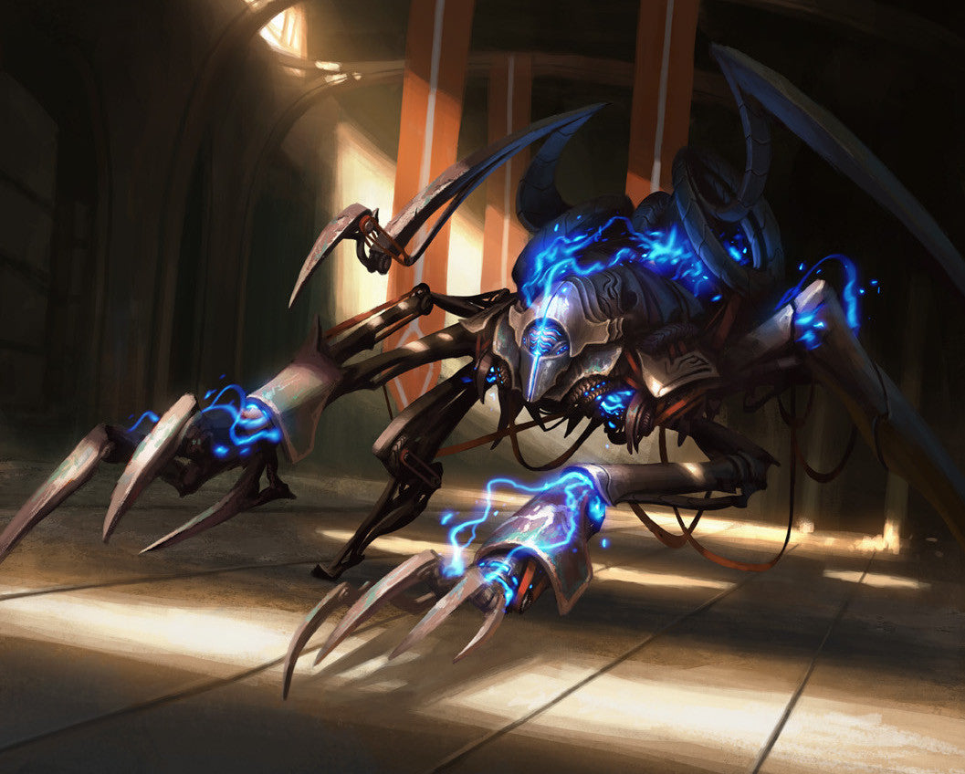
As with most Magic illustrations, we begin with the Art Description:
Context: This card depicts a new invention created by the renegades to fight the oppressive Consulate. It is brand new and the craftsmanship is exquisite, but it has a militaristic vibe.
Location: A clean, darkened warehouse
Action: Show us a bestial automaton, roughly human sized, made by Kaladesh renegades. Show us one that's four-legged and aggressive-looking, but doesn't resemble any particular animal. Its body is crisscrossed with arcs of aether, concentrated on its head and "claws."
It's always a little intimidating when you are assigned a reprint.
Are the fans going to like it? Are they going to hate it?
Since the aesthetic and goal changes from block to block, you can't always give the same vibe as the previous versions.
I think the fact that this is clearly a renegade invention was really important. This creation was designed to fight against the oppressive Consulate, so that needed to be clear.

Since we receive style guides for each set, I mainly used that as my reference.
I was lucky enough to have been on both of the concept pushes for Kaladesh, so I was very familiar with the subject matter, especially since I designed a lot of the artifact creatures.
Renegade artifacts need to look functional but also be beautiful to look at. They are handcrafted with love and aesthetics are important to them. They also incorporate a lot of Möbius strips, so those needed to be present.

I wanted to give the audience the feel that this artifact suddenly came alive in this dark warehouse.
I wanted it to be a little mysterious, so I wanted shafts of light to reveal certain areas of the creature. I think the energy aspect of the painting, or the aether, is important since they allude to the previous versions.

This painting was actually pretty straightforward, so my process was a little like the famous owl meme.
The aspect ratio is unusually tall, which was a bit weird considering the creature is wide. I ended up with a lot of negative space at the bottom, but I knew that area was going to be covered by the text box.
I started out with the ground plane and then blocked in the creature. After that I blocked in the environment.
I knew I wanted most of it in shadow (plus the brief called for that anyway), so I had to figure out where to place the shafts of light in order to make the painting interesting and show the elements that needed to be seen.

I'm very pleased with the level of drama captured in the piece. I tried to tell a story with the light, but I know some people don't like this painting.
Illustrating for Kaladesh was definitely a nice change of pace from some of the other sets, like Innistrad. Although, I did find ways to make this painting a little darker than some of my other Kaladesh paintings.
I will say one thing, I'm not going to miss filigree. Never again!
The original artwork for this Arcbound Ravager was created digitally.
You can check out Mike's portfolio of work and some more of his writing at The Art of Daarken website and you can find his prints on INPRNT.
Thank you Mike for sharing this story with us.
Check back next Thursday for more Art in Focus.