
Art in Focus - Kari-Zev's Expertise by Jason Rainville
The creative process behind each piece of Magic art is unique to the image and the artist.
From the art description to the final product, the Art in Focus series reviews every step involved in crafting the art of Magic the Gathering in the artist’s own words.
This week we shine the spotlight on the Kari-Zev's Expertise by Jason Rainville from Aether Revolt.
Take it away Jason.
I have a bit of a confession to make; Kaladesh was tough to work on.
I can only speak for myself, but the designs for the setting (swooping, twining threads of reflective brass) were not only a challenge to render, but were also tough to pin down from a design perspective; too regimented and they cease to match the setting, too wild and there’s no pattern at all.
So with that in mind, somehow a card that featured TONS of that same twisting metal ended up being the most fun, and in my opinion most successful, of my work in Kaladesh.
Brief from Mark Winters:
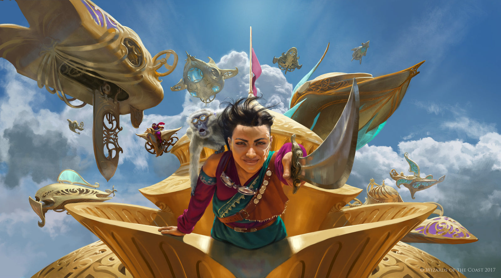
“Kari Zev leans on the prow of her airship, her monkey companion squats on her shoulder wearing its goggles. Kari, with a sword in her hand, thrusts it forward commanding the other ships in the fleet. Behind them, we can see some of the airships in her fleet, including the Heart of Kiran, to charge!”
As always I started off with some thumbnails on paper at actual card size.

I stick to this tradition to ensure that I keep the focus on theoverall composition and don’t get too carried away with details early on. The brief was fairly specific on the action and mood, so I was mainly just looking for a dramatic perspective.
I’ve found that my favourite and most well received paintings are almost always preceded by some healthy research and studies. I was very lucky to find stock photos of an Indian woman with clothing of the same colour as the Kari Zev reference I was given, as well as some cloud images from some of Noah Bradley’s great reference packs.

Quick studies of each subject allowed for some more informed colour sketching.
In the colour sketch phase I took my favourite pencil thumbnails and using the visual information I gained with my quick studies, tried to sketch different overall impressions of the scene.

The mood was described in the brief as “optimism and anticipation” so I aimed for a very bright and airy feel. While each perspective had its strengths (the bottom two felt the most dramatic) I sent in the top left one for approval as it had the most engagement with the viewer, and the numerous ships receding back into space would feel imposing and exciting.
Once approved, I contacted photographer and designer Patrick Gervais to help out with some reference material. With model Rita Debassige he delivered a large number of photos with a wide variety of lighting situations and poses. I collected the most relevant ones and added my notes so I’d remember which element helped where.

I wasn’t able to use her likeness since the character was already set, but these photos assisted greatly with perspective, cloth details, etc.
From here I began work on the image proper. I’m not the best at architecture, technology, or hard edges, but I learned a lot regarding perspective from “How to Draw” by Scott Robertson, and applied that early on.

Unfortunately it seems that I merged a lot of layers over the course of the painting so I can’t show every step, but I do have my early perspective and sketch work that have been compiled into a gif.

I can’t really describe what my design philosophy was with those ships.

I know it was a treat, as while the Kaladesh aesthetic was a tough one, I’ve loved creating my own ship designs since I was young. In this case I was looking for unique shapes like the piscine one on the lower left with its overlapping streamlined form, potentially functional bits like the dome and observation areas of the cruiser on the bottom right, or Indian inspired shapes like the prow of the ship on the mid-right. Little easter-egg details are one of the hidden joys of designing large-scale subjects like ships and cities.
From there I went on to complete the painting by painting new rough colours underneath my tight sketch, then painting overtop it all. Again, that section of my process is lost to the digital abyss, but I do have all the layers separated (a stipulation of the brief) so enjoy this GIF showing all of the various layers, from back to front;

Kari Zev’s Expertise challenged me while also speaking to my strengths, and while I think something was lost in her face from colour sketch to final image, I was uncharacteristically happy with how it all turned out.
The original artwork for Kari-Zev's Expertise was created digitally.
You can check out Jason's portfolio of work and some more of his writing at his website and you can find his prints on INPRNT.
Thank you Jason for sharing this story with us.
Check back next Thursday for more Art in Focus.